Opportunity,
well defined.
A financial software identity built around the ground you cover—and the upside you earn.
Meet the Fieldmark
Your territory.
Your upside.
Local ambition.
A clear share of what it earns.
Earnfield brings territory and earnings together in one memorable name. It gives the platform a purpose that can grow across companies, industries, and the people who represent them.
YOUR TERRITORY. YOUR UPSIDE.
Ready for what’s next.ONE COLOR. ONE CLEAR SIGNAL.
Defined ground.
Visible progress.
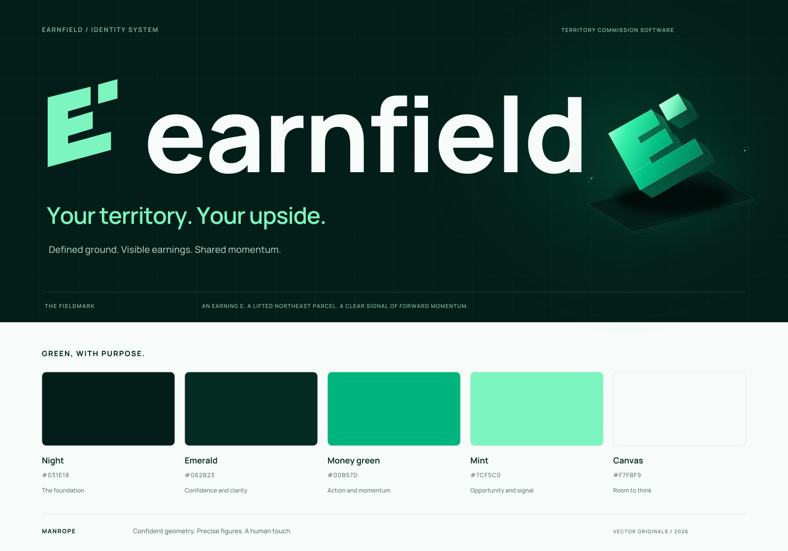
A strong “E” rises from joined earning bands. One northeast parcel lifts clear of the rest—a deliberate signal of new territory and forward momentum.
The open gap gives the symbol a distinctive signature. Its bold geometry stays clear on a salesperson’s phone, a company’s statement, or a large brand display.
Great potential.
Good to see
you, Maya.
The color of
earned opportunity.
Deep emerald creates confidence. Money green makes action clear. Mint brings energy to the moments that matter. Open, bright surfaces keep financial information easy to read.
The foundation
Confidence & clarity
Action & momentum
Opportunity & signal
Room to think
Clarity is a
competitive advantage.
A confident geometric typeface with a human touch. Strong headings, readable labels, and precise financial figures give every screen a shared rhythm.
Territory, clearly defined.
Measured geometry, open space, and crisp boundaries.
Money, clearly understood.
Financial figures lead. Green signals earned progress.
Confidence, everywhere.
One restrained visual language across every company.
Your brand.
Ready for the field.
Clean logo files for websites, app icons, presentations, and company statements.



Keep the master mark one color. Leave clear space equal to half the symbol’s width. Use the Fieldmark alone at compact sizes; 24px high is the recommended digital minimum. Sculptural artwork is a display treatment, separate from the master logo.